Soil is Farmbox's design system. It powers both mobile and desktop products across the platform.
Role: Lead Designer Platforms: iOS, Android, Web Deliverables: Component library, documentation, CSS code, Figma files
Helps the team
Faster development.
Design systems remove decisions. When every button, card, and layout is defined, developers stop asking questions and start building.
Freed-up designers.
Before Soil, designers spent 60% of their time on component work. After Soil, they spent that time on hard problems, like how farmers make decisions during a crop crisis.
How could we serve the farmer?
Following the farm routine.
Most days go as planned. Farmers choose fields, run operations, check results, repeat. Speed matters: the faster you log data, the faster you can act on it.
Managing a crisis.
Sometimes things don't go as planned. A pest outbreak. A weather shift. Suddenly, farmers need every data point we have, all at once, on one screen.
They asked for density. We had to deliver clarity too.
The constraint was density.
We studied how farmers make decisions during harvest season. They need to see everything at once: dozens of data points on a single screen. Our support team confirmed it: users on small laptops were squinting at cramped interfaces.
We needed a system that could pack in data without feeling chaotic.
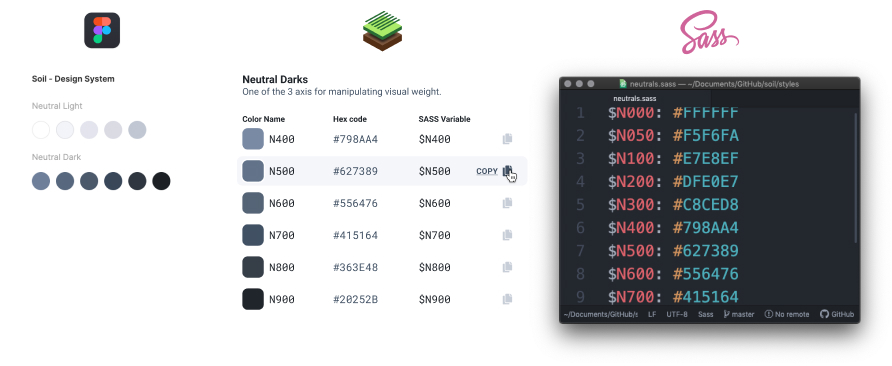
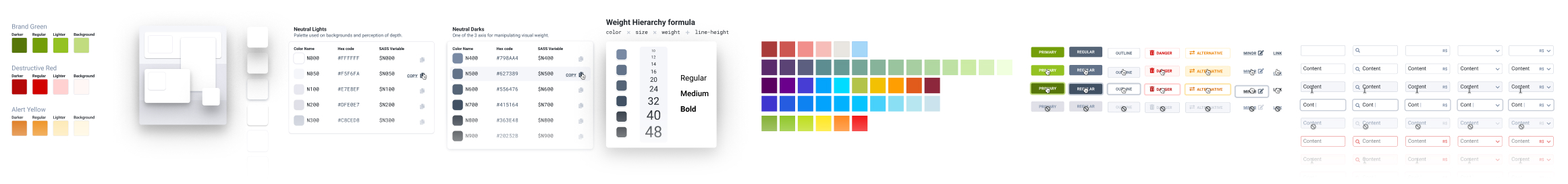
Soil enforces an 8pt grid, strict typography hierarchy, and consistent spacing. Every component snaps into place. You can cram a dashboard full of charts and it still breathes.
How I built it.
1. Study how the team already works.
I didn't start from scratch. I audited existing patterns, found what worked, and codified it. The goal was to surface hidden conventions, not impose new ones.
Design library and code is always the same.
2. Ship the basics fast.
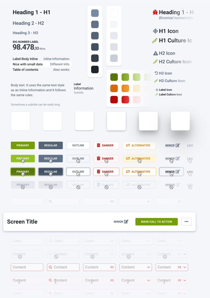
Colors, typography, spacing, buttons, inputs. The foundation. Lock these down and everything else follows.
It has everything it should.
Principles.
Context beats convention. Some Soil patterns break standard design rules. If it works for farmers in the field, it's right. I tested with real users. I validated with farmers in the field, not just in mockups.
Conventions over configuration. Designers shouldn't specify padding. They should spend their time on hard problems. Soil handles the rest.
Density is a feature. Soil works with two data points or twenty. The system scales without breaking.
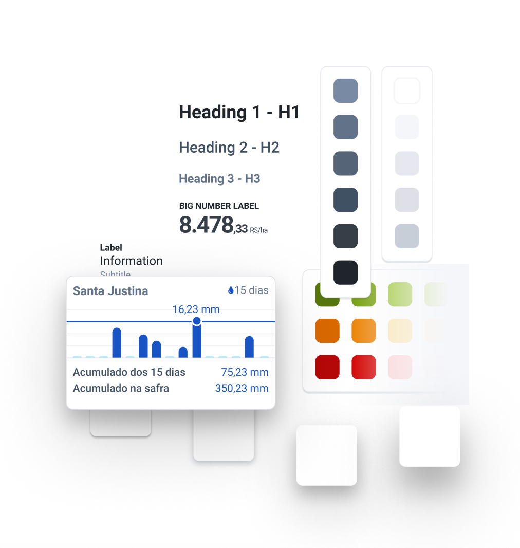
8pt Grid System
Everything aligns to an 8pt grid. Components sit top-left, centered within their containers. Layouts handle positioning; components handle content.
It felt rigid at first. Then we realized: constraints create speed. Designers stopped debating spacing and started shipping.
Layouts handle screen composition.
Components create rows, each centered on its content.
All elements have fixed width except the primary one.
The math guarantees grid alignment.
Farmbox mobile is used heavily under the sun…
Accessibility
✅ WCAG-compliant color contrast ✅ Video + Images before Text ✅ Self-describing components where content is the label.
Farmbox mobile gets used in direct sunlight. Contrast isn't optional.
Pixel perfect design library.
Perfect smart-layout and resizing constraints where needed.
All components work out of the box.
🚫 No component breaking!
Results
Faster onboarding. New designers got productive in days, not weeks. The system taught itself.
5x faster simple screens. Features that took a week now took a day. Soil handled the visual decisions.
More time for hard problems. Designers stopped pushing pixels and started solving user problems. That freed them to work on what actually mattered.
Cleaner handoffs. Before Soil: design → dev → QA → visual fixes → more QA. After Soil: design → dev → ship. Visual fixes dropped by 80%.
UI Design
How I designed farm management software used on over 4 million hectares of Brazilian farmland